This drawing was made by Jeroen Meijer of JAM visual design, Amsterdam, earlier this week during the workshop we held on Monday, November 26th, 2012.
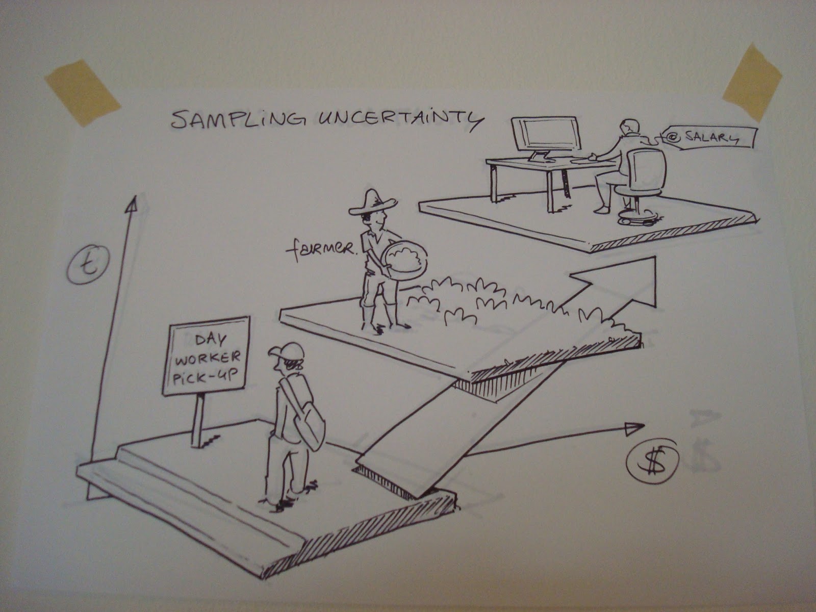
Its a visualization of the chart I use to show how participants were sampled for the prepaid economy project. The axes represent the individual’s ability to accurately predict either timing or amount of their cash flow status, and thus, their ability to plan. By all rights, this should be on the Prepaid Economy blog where this topic has been an ongoing matter for discussion but I wanted to share the communication potential of this format.
Its also a way to segment the undifferentiated masses in the informal economy, where traditional means to segment a population demographic such as income level or education may not be relevant or skew results leading to misinterpretation. What if one could cluster by patterns of cash flow, and thus, consumer behaviour?